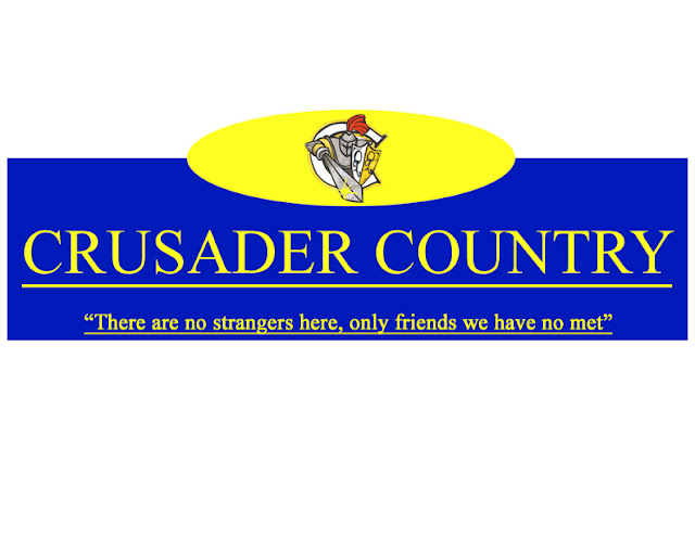
 My street sign was ver simple and straight to the point. I didnt want to go all out on something I knew wouldnt get picked. So i used a standard rectangle which was blue and used a yellow bold font. Using caplocks for the font for it to really stand out and catch some sort of attention. For the sign to not be so plain i added a semi circle at the top which was yellow and put in the crusader logo. A small quote was put in the botton which seems to be the school moto and add a little something to the sign. Very basic and straight to the point.
William Amaya 27
Wednesday, June 1, 2011
 My street sign was ver simple and straight to the point. I didnt want to go all out on something I knew wouldnt get picked. So i used a standard rectangle which was blue and used a yellow bold font. Using caplocks for the font for it to really stand out and catch some sort of attention. For the sign to not be so plain i added a semi circle at the top which was yellow and put in the crusader logo. A small quote was put in the botton which seems to be the school moto and add a little something to the sign. Very basic and straight to the point.
Monday, May 30, 2011
My pig assignment was very basic. I used a picture of Cristiano Ronaldo because i like soccer so I thought I should do something based around it. This was a perfect picture because it fit well with the pig head i found. the head was tilted so it fit well to sort of blend in with the body to the pig head. Secondly, I changed the jersey lettering which before spelled out AIG, I changed it to PIG to spell pig which I thought was creative in a way. Lastly it looked a little plain so I added a filter called "Poster Edging" to give it a more rough look to the background and give it more feel. I think it did a good job because it really completed the overall photo.
Monday, May 9, 2011
Photographic Triptych
For image number one, the original photo was a floor tile in the main foyer. I used the magnetic lassoo tool to give my pictures rigged edges so they'd be different and in my opinion, I think they look pretty cool. The filter used on this image was called "Plaster". The second image is a bulletin board, originally it was blue but I changed the contrast to darken the color. I cropped it so the glare of the flash was near the bottom adding a little extra to the picture. The filter I used is called "Glowing Edges". Lastly, for my third image it's Graham's sweater, the texture and design really caught my attention so I chose to use it. The original picture had a lot of texture and feel to it to begin with so all i did was add a filter called "Water Paper".
DJ Deadmau5 - "MDMA"
The main colour of the CD Cover was green, I added the green lasers in the background because it gives the overall image more life and it describes the atmosphere of the type of music. The mouse in the top left corner gave more feel and blended in well due to it was around the same type of green as the lasers. At first the laptop has a white bright screen which made it the focal point, something I didn't want. So I chose a color that would blend in more and not attract so much attention. I added the DJ with all of his turntables and equipment. I chose to use a picture of him with a blue mouse dead so the attention would be directed to it, as it stands out due to the fact its blue. Lastly, The Title of the CD was added, "MDMA" and the name of the DJ. My intent was to use green, but a different tone for it to stand out.
Wednesday, April 27, 2011
Monday, April 18, 2011
Poetry Assignment Cover
For this assignment, originally there was another idea to have a different theme but in the end it didn't quite fit and workout. I finished another cover that was much better and fit the point of the assignment well. Unfortunately I forgot to save it. so this came to my mind, its really simple, but in a way I kind of like how the two halves blend in to one another. the light blue font was picked so it could stand out from the darker type of blue in the sky. I'm not very happy with the overall result of the cover, it wasn't what i pictured it to be, but it was better than to not hand anything in at all.
Subscribe to:
Comments (Atom)


