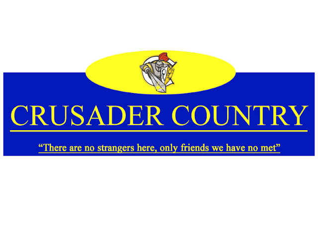
 My street sign was ver simple and straight to the point. I didnt want to go all out on something I knew wouldnt get picked. So i used a standard rectangle which was blue and used a yellow bold font. Using caplocks for the font for it to really stand out and catch some sort of attention. For the sign to not be so plain i added a semi circle at the top which was yellow and put in the crusader logo. A small quote was put in the botton which seems to be the school moto and add a little something to the sign. Very basic and straight to the point.